Core Functionalities
Session
Creating a session can be accomplished in two ways: by selecting the  option from the Start Screen or by clicking the
  icon in the toolbar while an existing session is active.
Start Screen
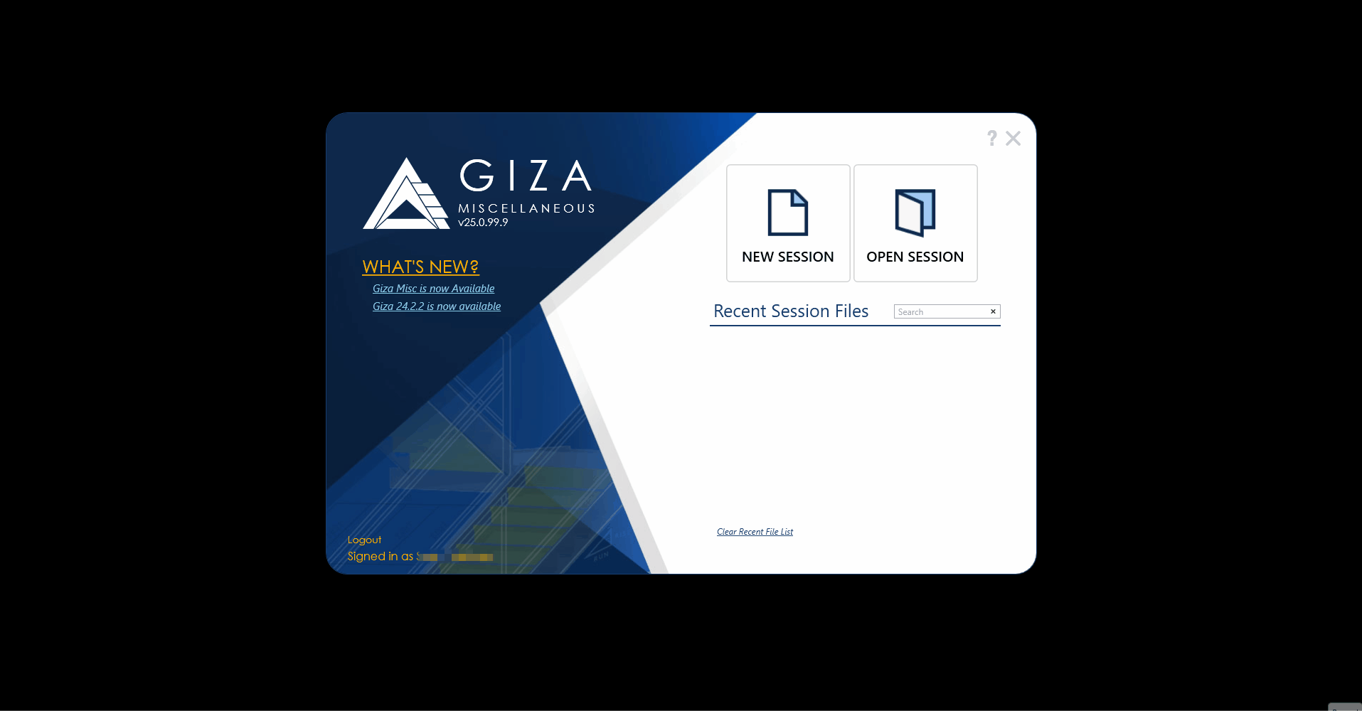
New Session
On the application’s Start Screen, click
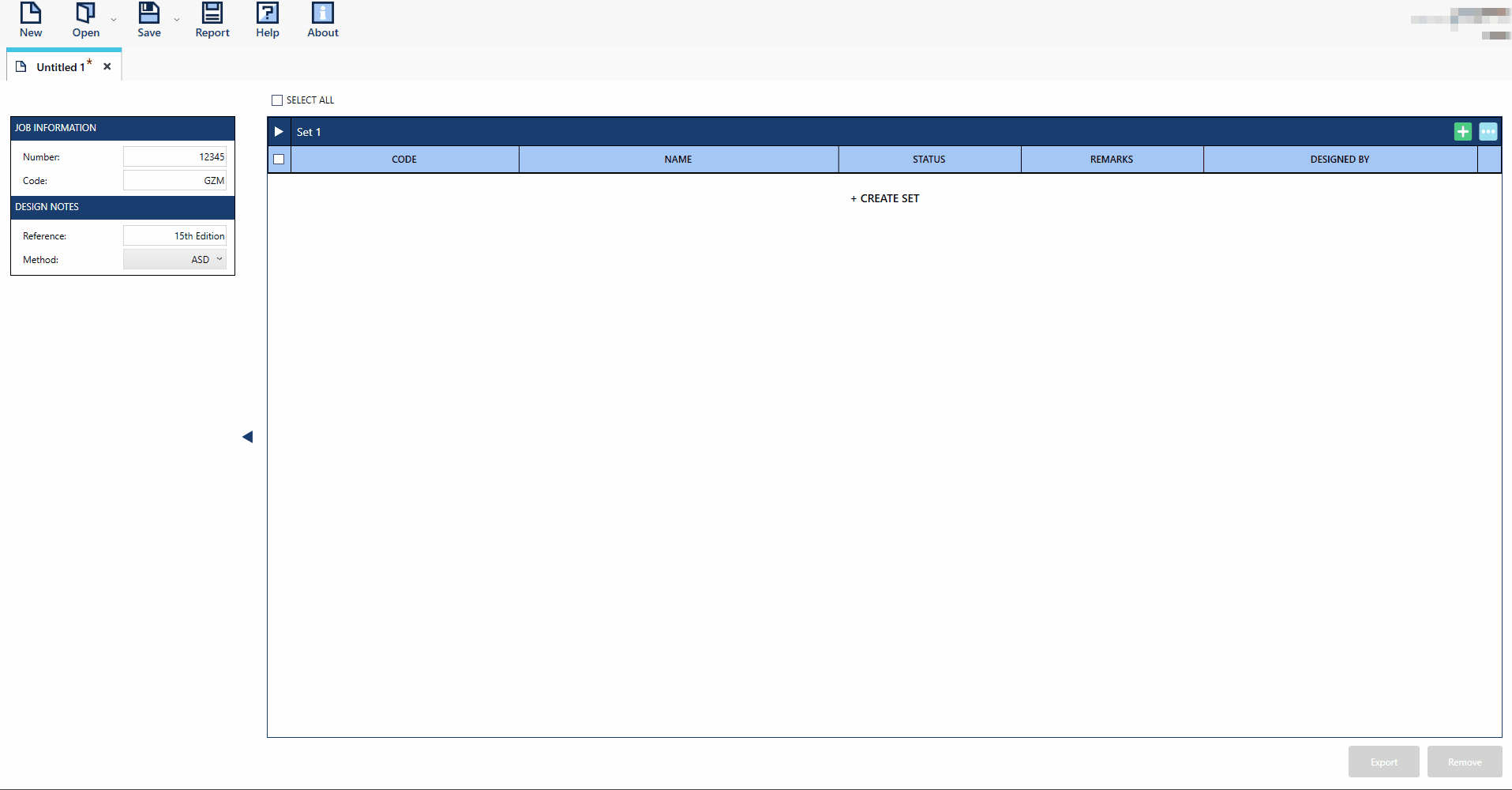
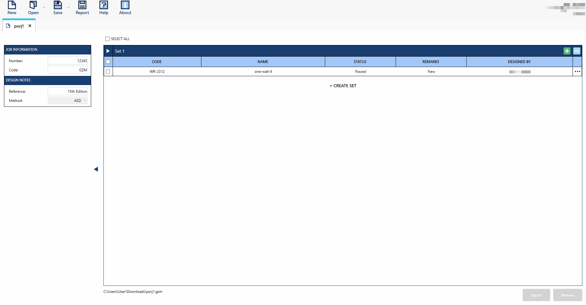
New Session. A default MLV tab will open automatically.To optimize your session, begin by adding templates to the default Set. You can rename the Sets as needed to better organize your work.
To add another set, click the
 button to add a new set. Once created, you can add templates to the set(s) as required.
To add a template(s) to a set, click the
 button. A template selector window will appear, showcasing all available template options. From here, simply choose the template you wish to add.
After a template is added, open it by clicking the (…) icon then select Open or by double-clicking the template.
Once opened, the template will launch in the Single View (SV) tab, displaying the template’s default interface for further interaction.
Open Session
Opening a gzm file can be done in 4 ways in the application. First is by the  in the Start Screen, second in the
  button in the toolbar and the last two are by opening recently create gzm files which can be located in the Recent File List in the Start Screen and in the Open button options in the toolbar.
On the Start Screen, click the
button.A file browser window will appear, allowing you to navigate your files. Locate and select the desired .gzm file.
Once the file is selected, click the Open button in the browser to load the session.

Recent File List
On the Start Screen, choose a file from the Recent Session Files list.
To load the file, either double-click on it, or right-click and select Open from the context menu.
Pin or Unpin recent files to keep important ones at the top of the list. Simply right-click a file in the recent files list and select Pin or Unpin from the context menu.

Toolbar
New
Another way to start a new session is by clicking the
button in the toolbar.Once a session has been created, users can initiate additional sessions by clicking the
icon in the toolbar.A new default session will open in a separate MLV tab.
To optimize your session, add sets and templates as needed. You can also rename the session, set, or template names for better organization.
After a template is added to your session, open it by clicking the (…) icon then select Open or by double-clicking the template.
The template will then launch in the Single View (SV) tab, displaying its default interface.

Open
Click the
button in the toolbar.A file browser window will appear, prompting you to choose your file. Locate and select the desired .gzm file from your directory.
After selecting the file, double-click to load the session.
Recent File List
Click the
button in the toolbar.In the Recent File List, click on the file you wish to open.
Save
Continuously save the progress and changes made to the current session.

Save As
Create a duplicate or revised version of the current session by saving it with a new name.
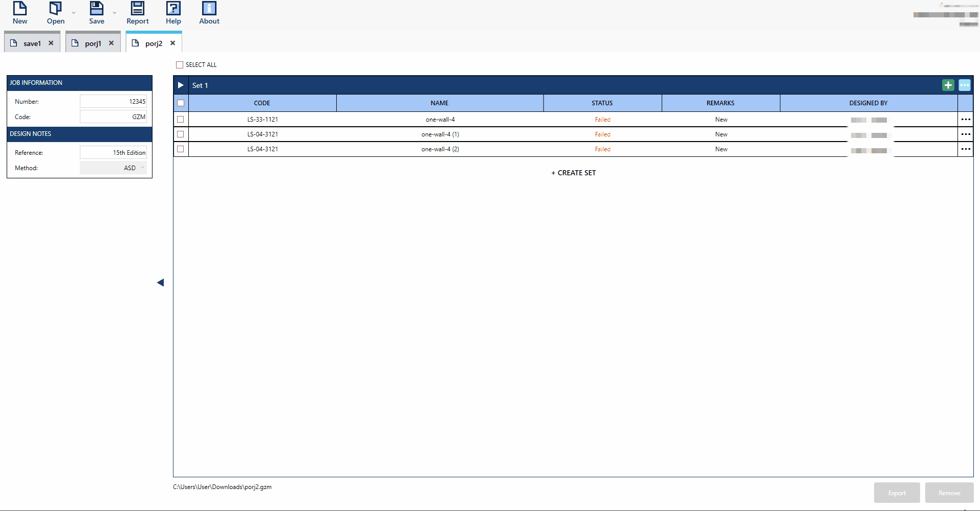
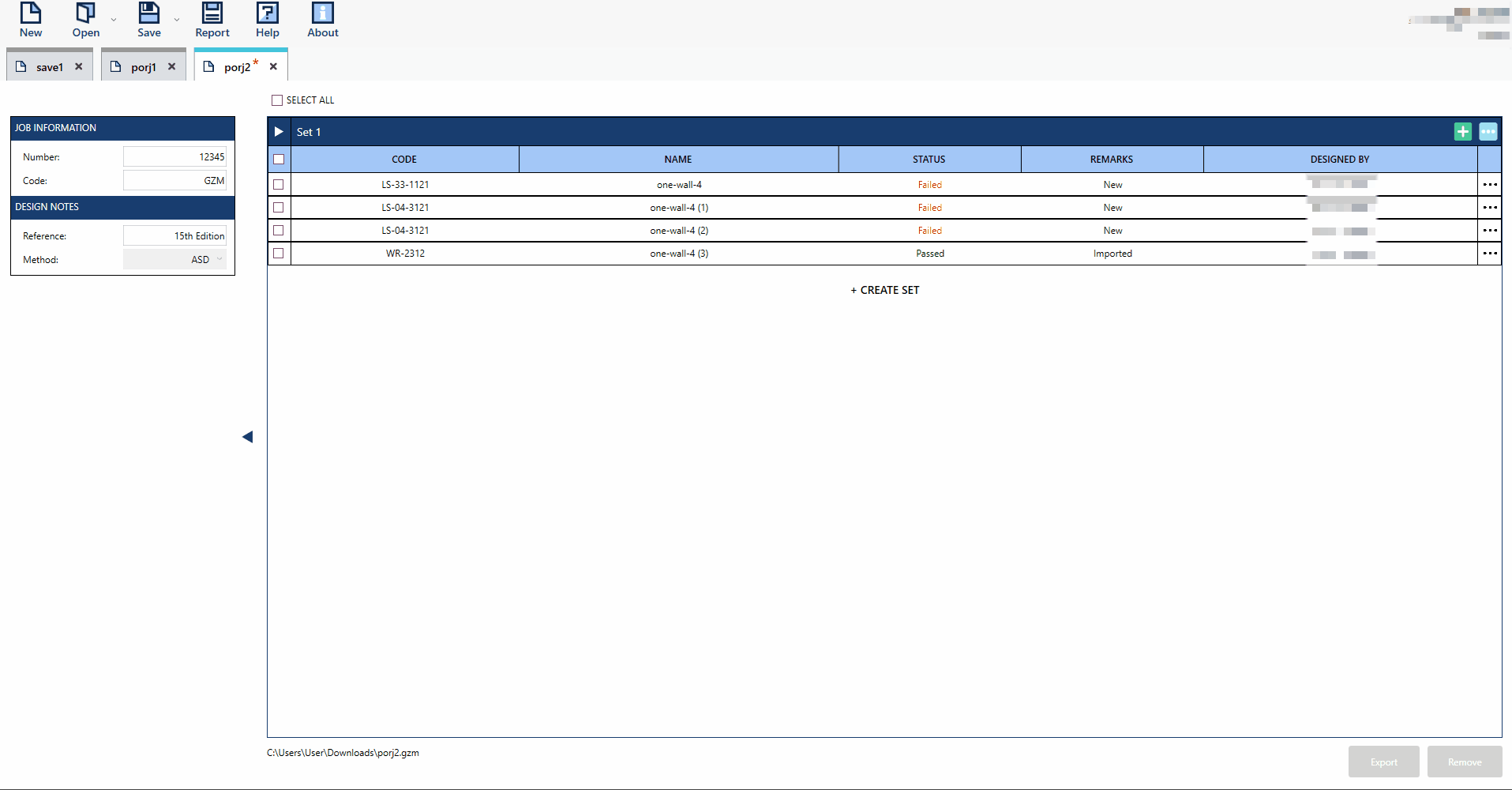
Import
Import button in the Set options is a feature where user can add templates from another session to the current session given that the file is a .gzm format. Importing is a customized extraction of set(s) or template(s) from the imported file into the current session file. User can only import one session at a time.
In an active session, click the Import
 button in the set. This action will open a file browser.
Browse and select the desired session file. Then, either click Open or double-click the file to proceed to the import window.
In the import window, choose the template(s) or set(s) you wish to import.
Click the Import
button within the window to load the selected templates into the active session and specified set.
Export
Export button allows saving a session as a new file, creating a separate session. Imported sets or templates will use the current session’s file name by default. This feature functions like a “Save As” command, enabling users to save selected sets or templates into a new session file.
In an active session, choose the template(s) or set(s) you wish to export.
Click the Export
 button to open a Save As window. This allows you to save the selected templates or sets as a new file session.
Enter a desired file name or use the default name. Click the Save button to complete the process.
Navigate to the specified file directory to locate and confirm the exported file session.
Report
Report button is accessible via the toolbar in both Multiple List View and Single View, with slightly different functionalities in each mode. This feature enables users to generate a preview or export a PDF file containing the calculation reports for the selected template(s). In MLV Mode, users can generate multiple pdfs for multiple templates selected.
MLV Mode
Choose the desired template(s) before clicking the
 button in the toolbar.
A Print Options window will appear. Modify the details as needed to tailor the information displayed in the report.
Click Save as PDF to create the report as a PDF file and save it to the preferred file directory.
SV Mode
Click the
button in the toolbar.A Print Options window will appear. Modify the details as needed to tailor the information displayed in the report.
Click Print Preview to view the pages of the calculation report. You can save the file as pdf in the print preview window.
Click Save as PDF to create the report as a PDF file and save it to the preferred file directory.
Check and Recommendation
By default, all applicable limit states are displayed in the Checks and Recommendation’s expandable panel.
Checkform
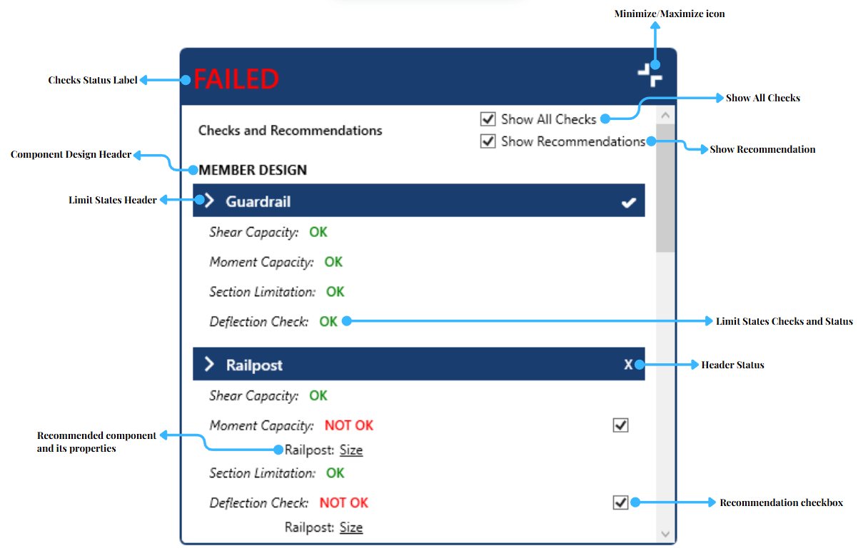
Check Status Label - Display overall remarks on the template’s limit states checks.
Minimize/Maximize icon - Collapse/Expand the Check and Recommendation expandale panel.
Show All Checks - A checkbox that displays or hide applicable limit states. Unchecked checkbox will only display unsatisfied checks.
Show Recommendation - A checkbox that displays or hide recommended properties for failing checks. Unchecked checkbox will hide recommended properties and unchecked recommendation checkbox.
Component Design Header - Indicates the subdivision of the member and connection design checks and recommendations.
Limit States Header - Collapse/Expand the applicable limit states of its component checks.
Header Status - Overall status check of each limit states header.
Limit States Checks and Status - Applicable limit checks in a component and its status.
Recommended component and its properties - Recommended properties that are hyperlink to properties in UI to satisfy failed checks.
Recommendation checkbox - A checkbox that displays or hide recommended components and its properties.
Design Sample
Click the Minimize/Maximize icon of the Checks and Recommendations expandable panel to reveal its contents.
Explore the panel’s sections. Refer to the guide above for further instructions.
Untick the Show All Checks checkbox to display only the unsatisfied checks.
Tick Show Recommendations to display recommended components and its properties.
Click the underlined recommended properties to be directed to the corresponding fields in the interface.
Adjust the properties as needed to meet the requirements and satisfy the checks.
Template Design
Templates can be added, removed, and modified by the user depending on the design requirements of the job. The template design section includes the following features:
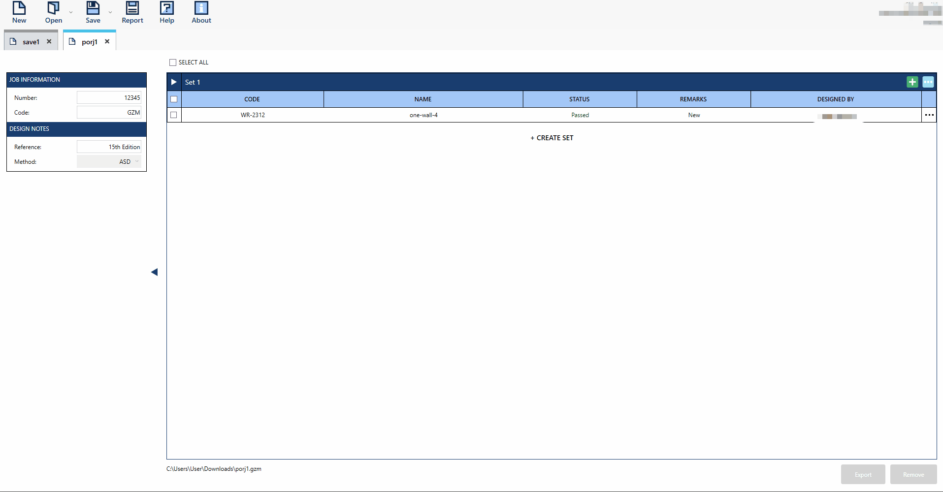
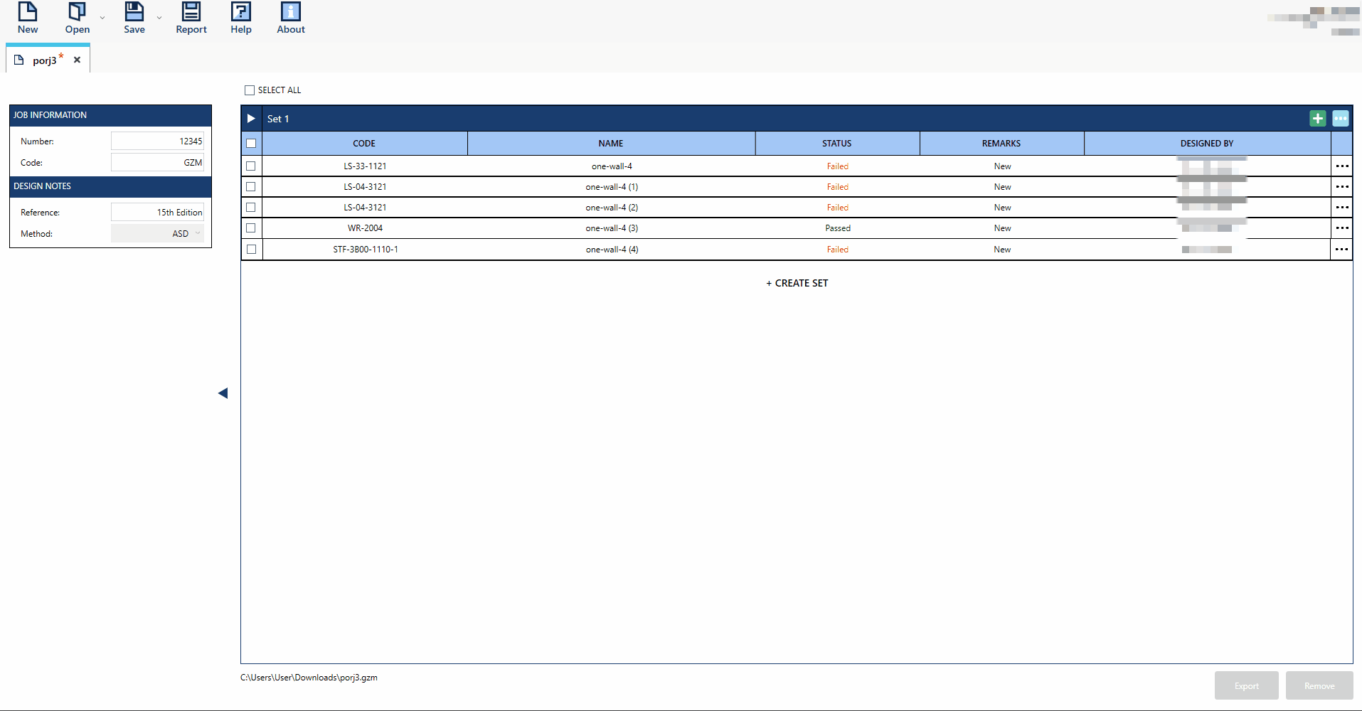
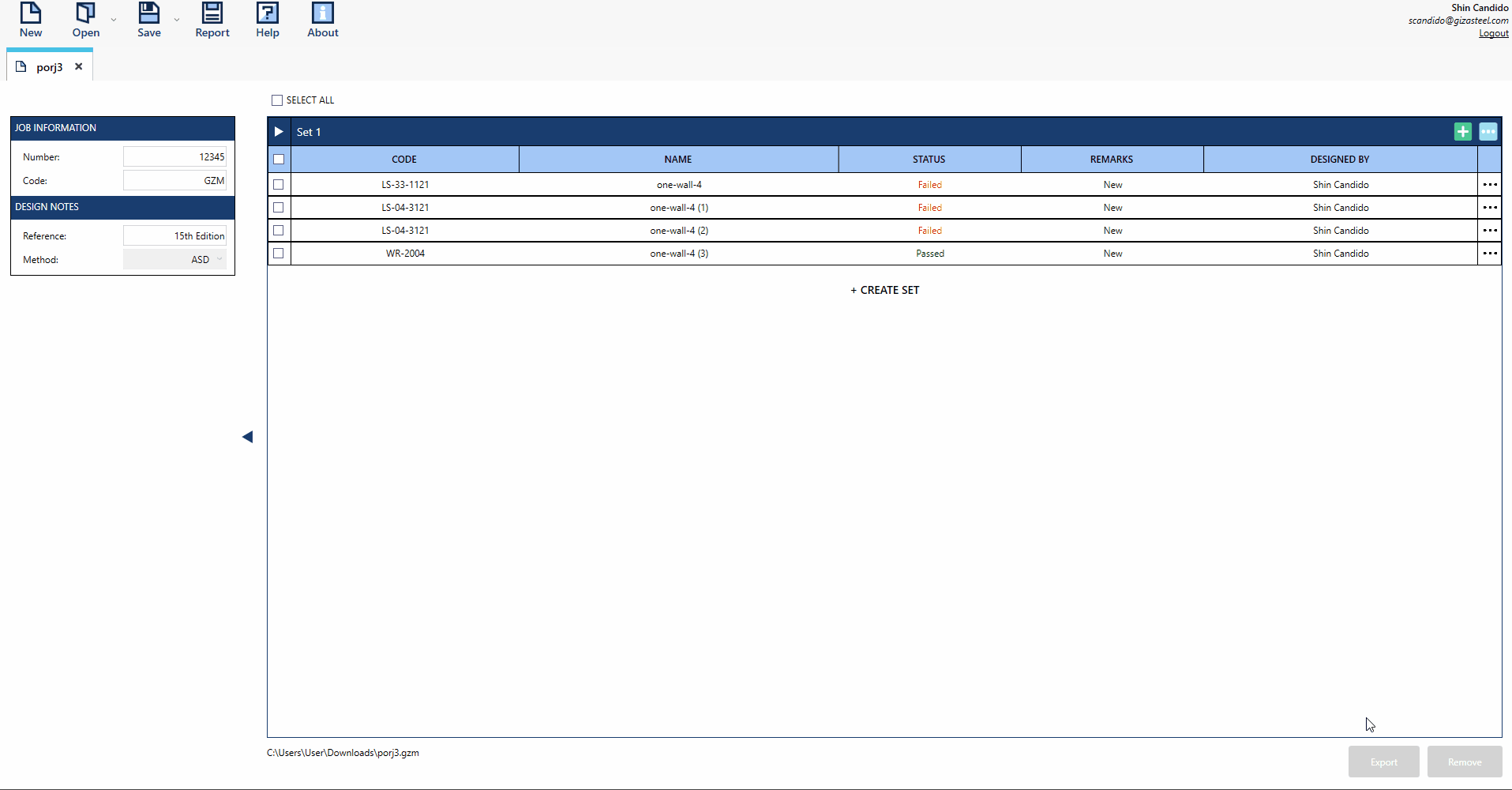
Set
In a created session, adding a set is the first step to include data or templates for design. Templates cannot be added without a set. A session with only a set is considered an empty file session.
- How to Create and Delete a Set:
Click
button to create a session. A default Set 1 is displayed in a newly created session.Click
button to add another sets.

To delete a set, click on the
 icon of the set you wish to delete and click the
  button.
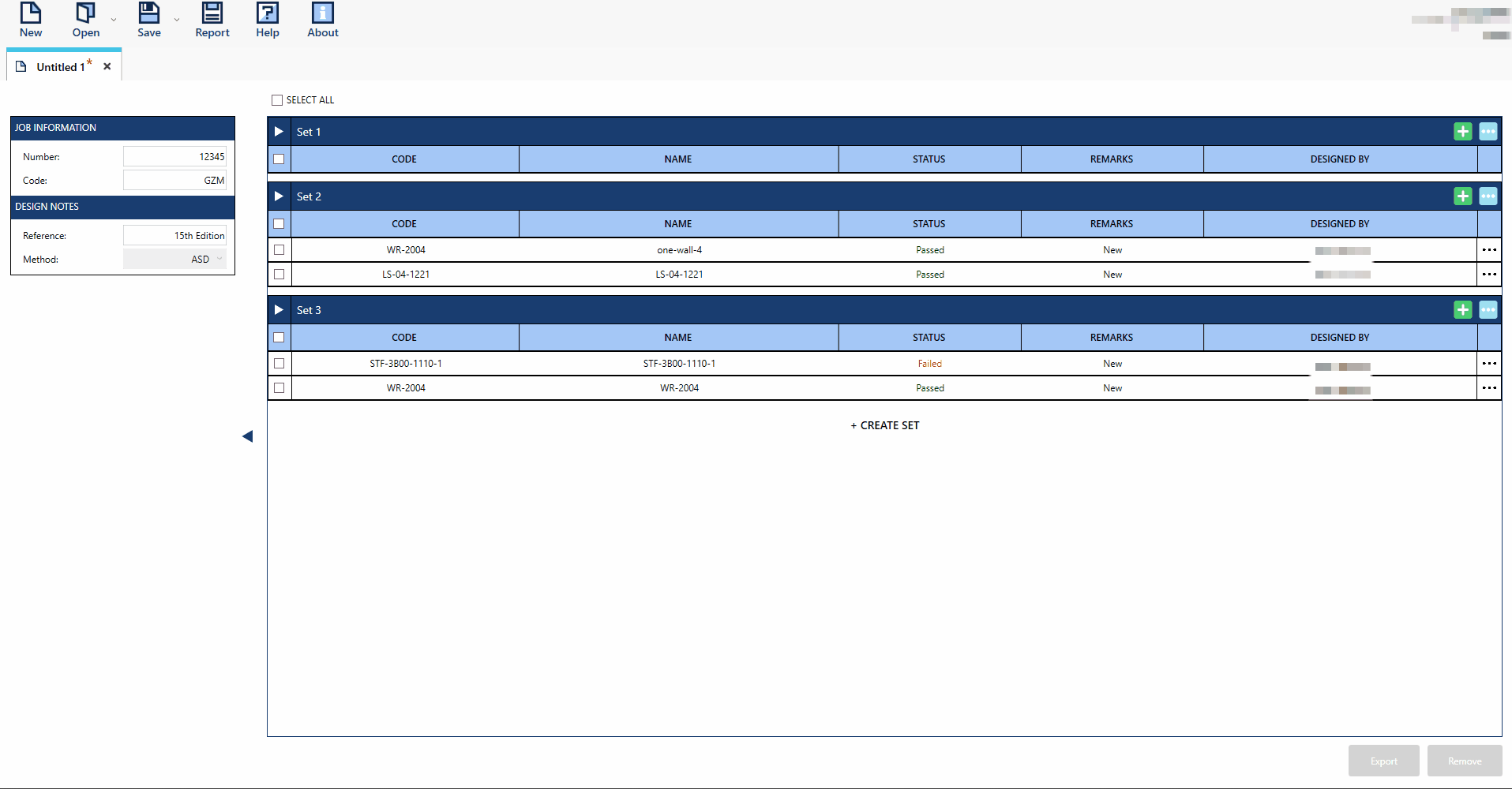
Add Templates
emplates can only be added after a set has been created. Users can then add templates to any set created.
Templates can only be added after a set has been created. Users can then add templates to any set created.
Click the
button to open the template selection window.In the template selection window, choose the template you wish to add.
If desired, enter a new name for the template in the Template Name text field.
Double-click the selected template to add it.

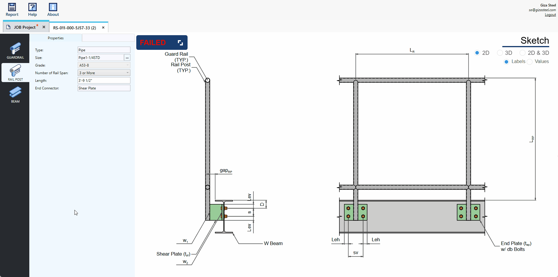
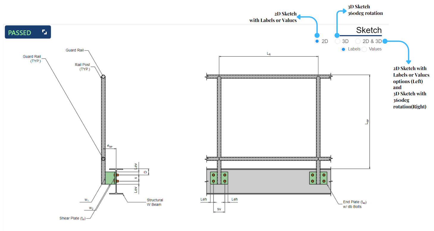
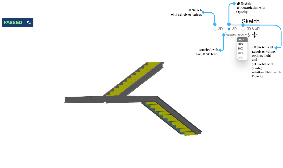
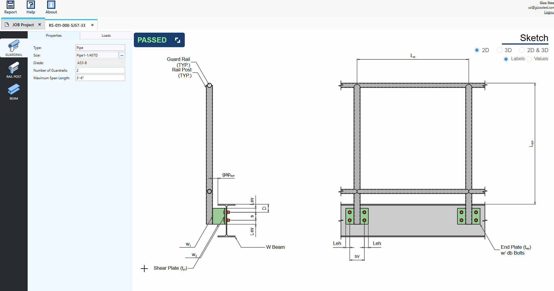
Dynamic Sketch
The sketch display offers three viewing options: 2D View, 3D View, and a Side-by-Side 2D and 3D View. Only the 2D View includes labels and values for greater clarity.
- Wall Rail and Railing System:
- Stairs:
2D:
In the Sketch Area, you’ll find radio buttons for 2D, 3D, 2D & 3D, Labels, and Values.
By default, the 2D and Labels radio buttons are selected.
Tick the Values radio button to show the property values based on the UI inputs.
Reposition the sketch by dragging with the left mouse button.
Easily zoom in and out of the sketch by scrolling with your cursor for precise navigation and detailed viewing.
2D in Stairs is in isometric view so as its labels
Legend is displayed in stairs template skethches to his distinguish member components.
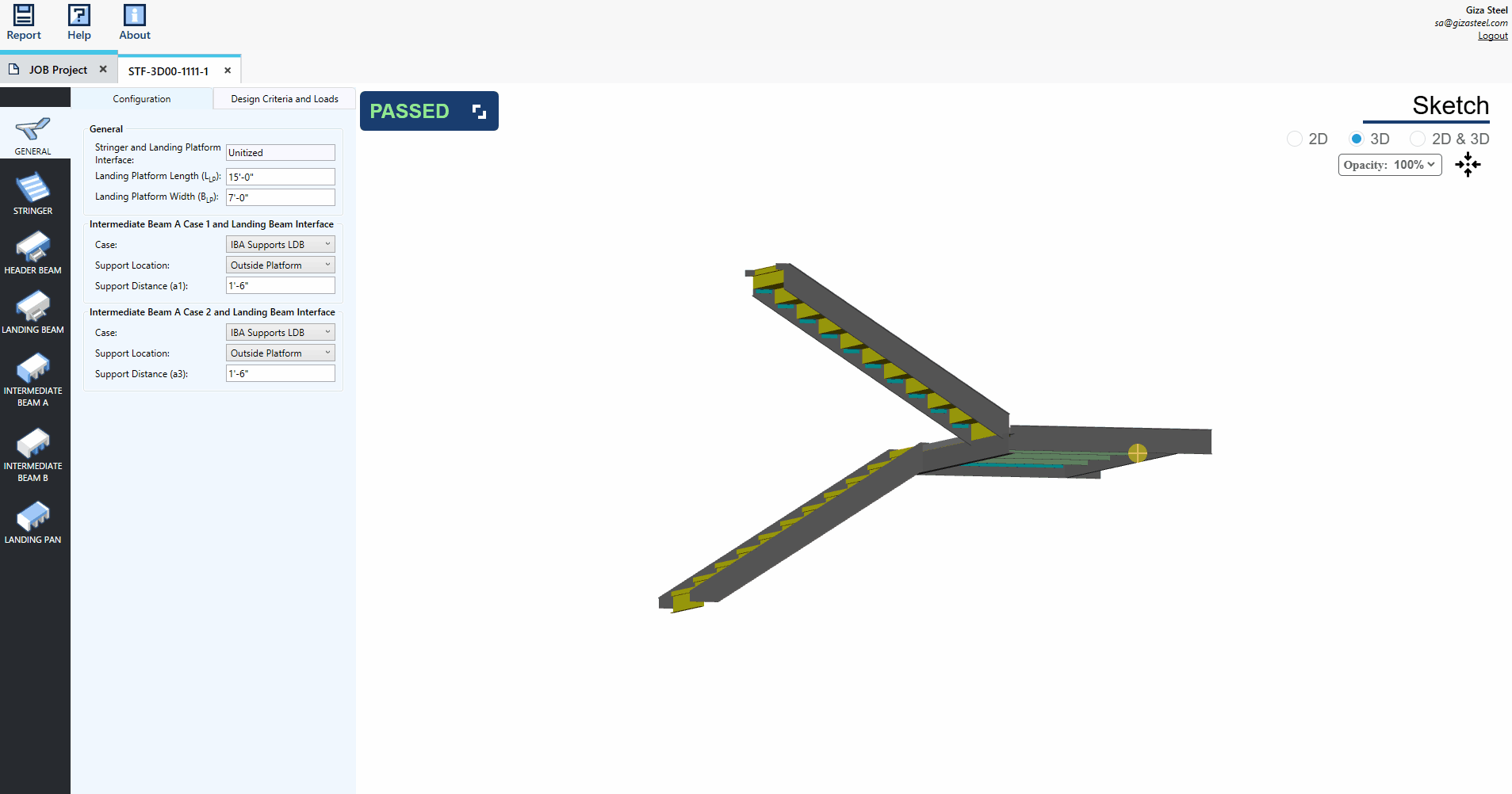
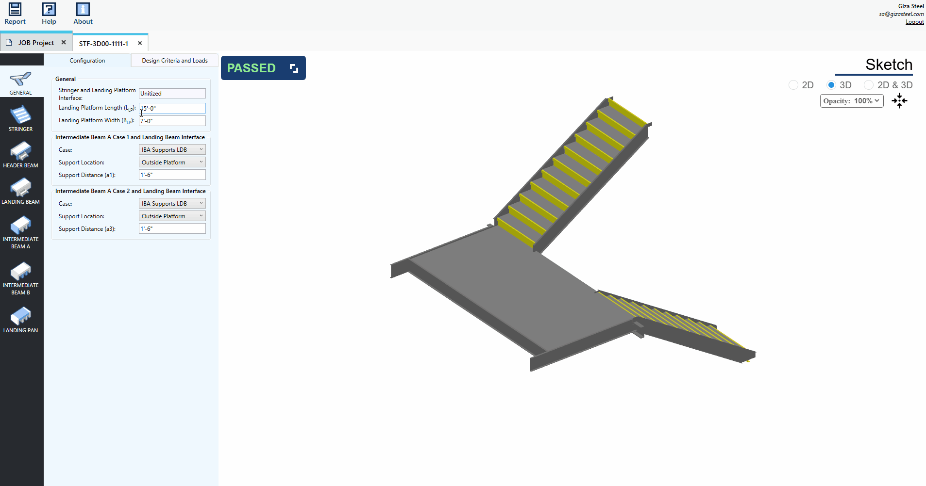
3D:
In the Sketch Area, tick the 3D radio button to view the 3D sketch.
Rotate the sketch using the left mouse button and reposition it by dragging with the right mouse button for seamless interaction.
Easily zoom in and out of the sketch by scrolling with your cursor for precise navigation and detailed viewing.
The opacity feature in stair sketches enhances component distinction and improves visual clarity.
2D & 3D:
In the Sketch Area, tick the 2D & 3D radio button to view the side-by-side 2D and 3D vizualization.
2D: Select your preferred display option by ticking the “Labels” or “Values” radio button.
3D: Rotate the sketch with the left mouse button and reposition it by dragging with the right mouse button for intuitive control.
Stairs: For 3D stairs, select desired opacity level of the components.
Universal Navigation: Zoom in and out effortlessly by scrolling with your cursor for precise adjustments and detailed exploration.
Design Template Properties
User can modify the properties of a template in Single View.